7 Things You Need to Know About Apple’s New Operating System OS X Yosemite

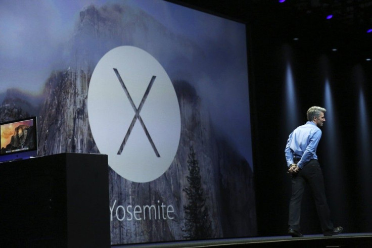
Apple announced a new operating system called "Yosemite" on Monday, June 2 at the World Wide Developer's Conference in San Francisco. The next version of the OS X is named after the renowned national park in California. There are several new features to excite Mac enthusiasts. Here are the key features.
Redesigned User Interface
The OS X Yosemite is designed to "elevate" the Mac experience. Apple boasts of refining the entire interface "pixel by pixel." Greater capabilities are built into the interface that will make it easier for users to get "need-to-know information" in a much easier manner. There is a fresh new look in addition to the "power and simplicity" that users have fallen love with.
Seamless Communication Between Macs and iOS Devices
There will be a more seamless communication between Macs and iOS Devices with a feature dubbed as "Continuity." You can start writing your email on your iPhone and finish it automatically on a nearby Mac. You can also make or answer phone calls and send or read text messages of an iPhone through the Mac.
Greater Translucency
Apple has added greater translucency to certain Yosemite interface. More emphasis is given on the content. Translucent sidebars and toolbars make it more effective as well as sleek. The desktop image is visible, so is the content.
Streamlined Toolbars
The toolbars are streamlined in Yosemite without compromising with the capabilities. Safari is able to access Web sites when you click the smart search field. The Tab View button makes it possible to see all the open tabs in Safari. Calendar and Maps are also streamlined.
Cleaner Dock
The Dock which is used by several users as the easiest option to launch an app has not got a simplified look. It is more iconic which means that it is more harmonious and consistent now. Each icon can be easily recognisable now.
Prioritised Notification Center
There is a new feature called Today in Yosemite Notification Center which prioritise according to the present moment. It shows reminders of the day, birthdays, upcoming event. You can also get a summary of the next day's events. Widgets like Stocks, Weather, Calendar, World Clock, Reminders and Calculator can be easily accessible now.
Brighter Spotlight
The Spotlight is redesigned and now has a much brighter look. It appears front and centre when opened. You can look up information from major sources such as news, movies and Wikipedia. The previews are more interactive. Clicking on a particular result can enable you to send emails, read documents and make phone calls.
Reference: Apple, TIME
Contact the writer: s.mukhopadhyay@ibtimes.com.au


