Google starts rolling-out redesigned Google Play Store to Android devices
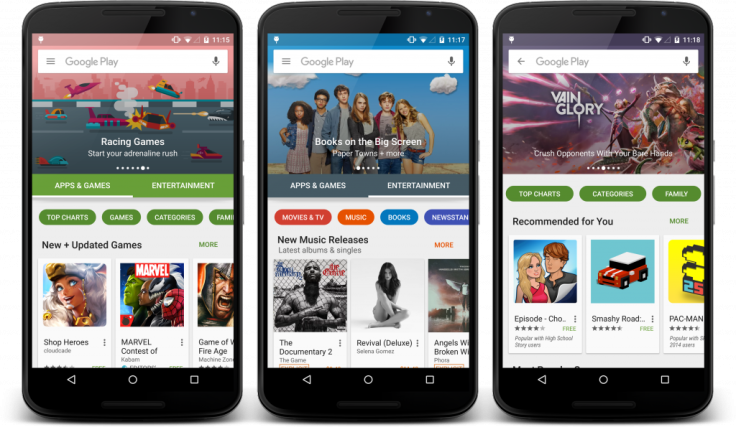
The refreshed store will feature two primary tabs: Apps & Games and Entertainment

Google recently teased a fresh look for Google Play Store and has now started rolling-out the redesigned and eye catching Play Store to all Android smartphones and tablets. It’s not a complete overhaul but the new layout is fresh and a lot more organised.
The refreshed store will feature two primary tabs: Apps & Games and Entertainment. Currently, Google Play Store has six categories: Apps, Games, Movies & TV, Music, Books and Newsstand.
There will be sub-categories like Music, Movies, TV Shows, Books and Newsstand within the “Entertainment” tab. The “Apps & Games” tab will have sub-sections for Top Charts, Games, Categories and more.
Each page on the Entertainment tab has image galleries and quick buttons at the top. The revamped Play Store organises categories better and has a contemporary look. Google also added animations and scrolling effects, reports Android Central.
Last week, Google UI engineer Kirill Grouchnikov, who has long worked on the app, posted a few images showcasing the upcoming changes to the Google Play Store on Android on Google+.
The new, simple tab-based interface of the Google Play Store has better content separation. The layout is more user-friendly and searchable. The new design focuses on quick navigation, as well.
As noticed by Android Police, the new design comes with a small watch icon equivalent to the Android Wear icon for apps. The icon says “Enhanced for Android Wear” and most of the apps come with Wear support, except Keep and Hangout.
Most of the Android devices are expected to be notified about the update next week. Google updates are staggered and thus, it will take some time for the update to hit all devices.
Contact the writer at feedback@ibtimes.com.au or tell us what you think below.


